Examples
Basic Examples
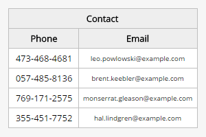
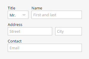
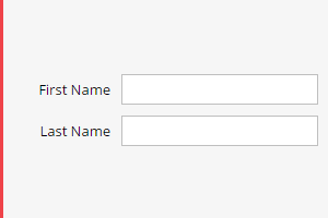
Login Form
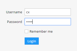
No need to worry about form validation and layouts any more. Cx takes care of that for you. Learn how to create a simple Login form.
Basic Grid
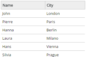
Grids are super easy in Cx. Check this example to learn how to create simple grids.
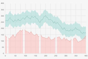
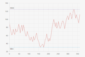
Google Stock Price
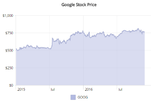
Who said line graphs have to be hard? Learn how to create this simple LineGraph example showing Google stock price.
Showcase
Column Graph + Grid
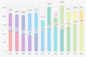
Column graph with draggable markers accompanied with a grid control.
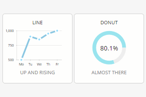
Dashboard-like Grid
A large grid using various widgets to visualize and edit the data in the same time.
Dashboard Widgets
Sample markup and components combined into dashboards widgets.
Trello Clone
Organize tasks using drag & drop.
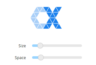
Cx Logo
Play with Cx logo.
Cx Pong
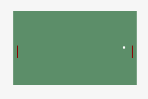
Play against yourself.
Home Budget
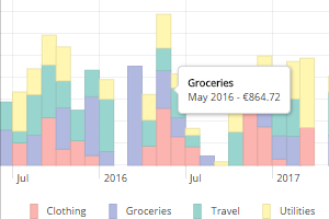
Home budget mockup app.
Loan Calculator
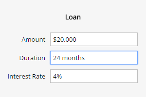
A sample application for calculating loan payment schedules.
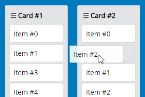
Grid to Grid Drag & Drop
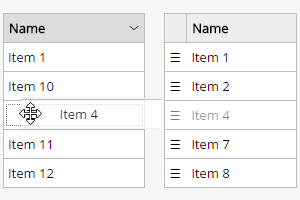
Drag and drop rows from one grid to another.
Check Accordion
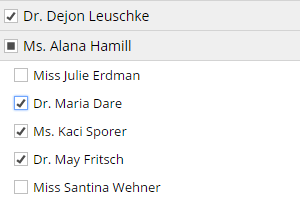
Tree-like structure useful for organizing numerous checkboxes into categories. Alternative to multi-value select.
Grids
Grid - Grouping
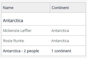
A grid with grouping and totals.
Grid - Dynamic Grouping
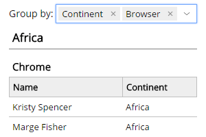
Multi-level grouping based on user selected columns.
Grid with Pagination and Filtering
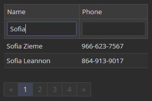
Limit grid height with the use of pagination.
Grid with Multiple Selection
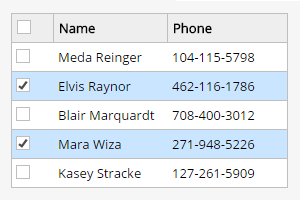
Grid with check based selection.
Grid Row Editing
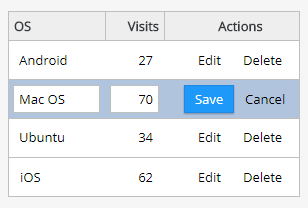
Edit grid cell values directly in grid.
Grid with Form Editing
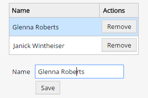
Create a grid where you can select a row and use a form to edit it.
Tree Grid
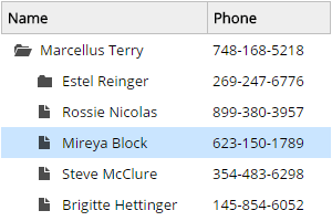
Learn how to make a folder tree using a grid control.
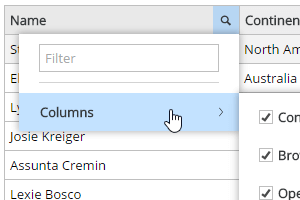
Grid with a Complex Header
Grid header split into multiple lines.
Grid Column Visibility
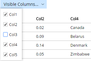
Toggle grid column visibility using a dropdown menu.
Grid Header Tools
Learn how to add custom header tools to your grids.
Grid Loading Mask
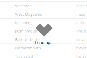
Learn how to add loading mask in grid.
Concepts
Repeater
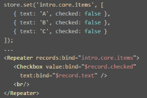
Repeater widget can be used for displaying collections using a template.
Sandbox / Rescope
Learn how to combine Sandbox and Rescope to simplify your code in some advanced usecases.
Data Binding
Data binding is a process of connecting the application state to the UI. Data changes will be reflected in the UI and user actions will be properly translated into data changes. Explore some of the ways to bind data in Cx.
Controllers
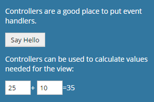
Controllers are used to concentrate business logic required for views and can be assigned to widgets using the controller attribute. Once assigned, controllers are passed down the widget tree.
Throttle / Debounce
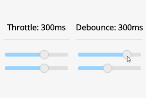
Sometimes you want to limit the rate of change propagation or to postpone the change until the user finishes the interaction. In such scenarios throttle and debounce come in very handy.
Property Selection
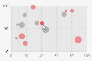
In this mode, selection is handled by setting a designated selection property to be either true or false. In this example a BubbleGraph is used to demonstrate the concept.
Key Selection
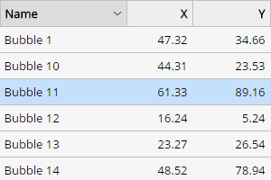
Key selection is a more common selection mode, where selected value(s) is/are stored in a separate variable.
Outer Layout
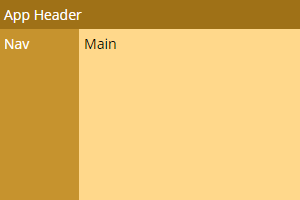
Outer layouts define wrapper around the content being rendered. This is very convenient when multiple pages need to share a common layout or for defining global application layouts.
Inner Layouts: LabelsTopLayout
LabelsTopLayout is used for dense forms with very long labels or when putting labels on top might save some space.
Inner Layouts: LabelsLeftLayout
LabelsLeftLayout is used to get a horizontal form layout.
Charts
Pie Chart
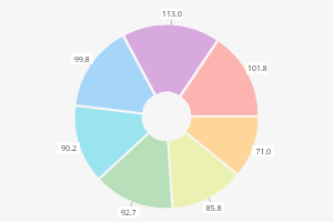
A simple pie chart with a legend and selectable segments.
Multi-level Pie Chart
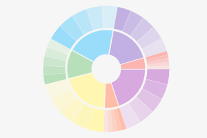
Pie charts can contain multiple levels.
Line Graph
A simple line graph with a legend.
Stacked Line Graph
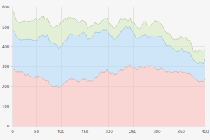
A line graph with stacking option.
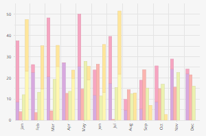
Column Graph
Column graph with rotated labels.
Timeline
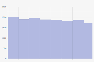
Illustration of combining multiple chart elements into a timeline widget.
Stacked Column Graph
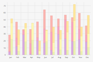
Stacked column graph with multiple stacks per each category.
Normalized Column Graph
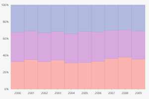
A sample of a multi-stack column graph where values are normalized in each category.
Auto Calculated Column Width
A sample of a multi-stack column graph where column widths and offsets are calculated based on the number of items.
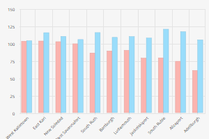
Bar Graph
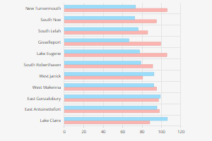
A simple bar graph accompanied with a legend.
Bar Graph Stacked
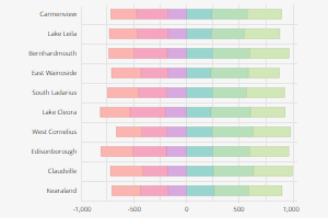
Stacked bar graph with positive and negative stacks.
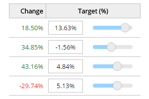
Bullet Chart
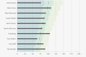
A sample bullet chart implementation showing the actual and target values in context of bad, satisfactory and good range.
Scatter Graph
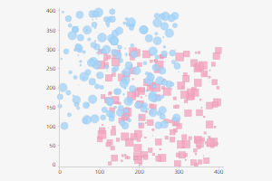
A simple scatter graph with a clickable legend.
Markers
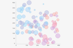
Draggable markers of different sizes and shapes.
Marker Line
Marker lines used to highlight peak values.
Ranges
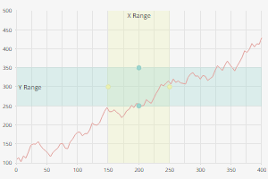
Example of horizontal and vertical ranges with draggable handles.
Color Map
Auto assign best colors to chart series.
Advanced Legend
Display legend entries inside of a grid, alongside other related data.
Forms
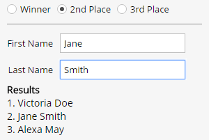
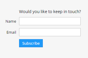
Validation Group
A simple form illustrating use of the ValidationGroup widget.
Tabbed Form Validation
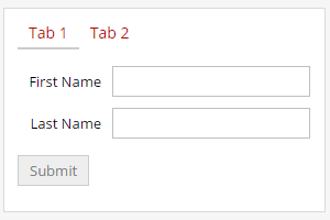
Validation of a form made out of a couple of tabs.
Calendar
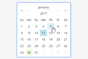
Create a Calendar widget with just one line of code.
Month Picker
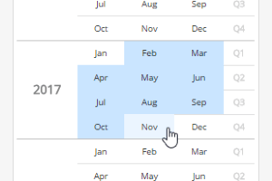
MonthPicker widget can be used for selecting months, quarters or years.
Color Picker
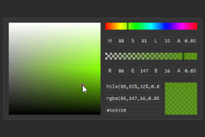
The ColorPicker widget is used for selecting colors.
Lookup Field
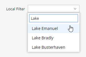
Lookup Field offers selection from a list of available options with additional features such as remote data fetching, search and multiple selection.
Select
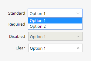
The Select control is a wrapper around the native HTML select element.
Labeled Container
LabeledContainer widget is used in combination with LabelsLeftLayout to group multiple items under the same label.
Labels
Labels are usually simple texts, however, sometimes it's required to apply different styling or put additional content inside them.
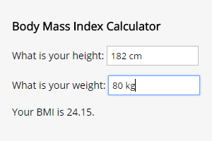
Number Field
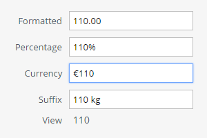
The NumberField control is used for numeric inputs, including currencies and percentages.
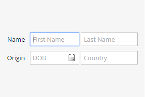
Text Field
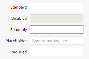
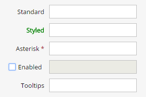
Text field control is used for single line textual inputs. Many different states make it an advanced control.
Slider
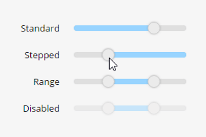
Multiple types of sliders (standard, stepped, range and vertical).
Switch
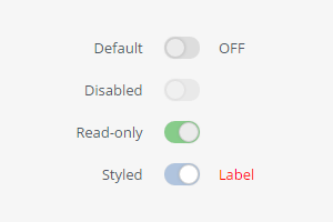
Switch is a two-state toggle widget commonly used instead of a Checkbox, as it offers the same functionality in addition to its modern appearance.
Checkbox
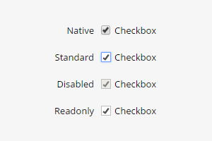
Checkbox is a commonly used widget for expressing binary choices.
Radio Button
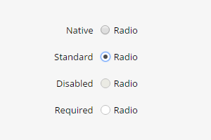
Radio buttons are commonly used for making a single selection within a limited number of options.
Miscellaneous
Menu
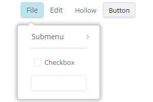
The Menu widget is used to present a list of options or commands in a horizontal or a vertical form. The Submenu widget is used when multiple options need to be shown under a single menu item.
Tabs
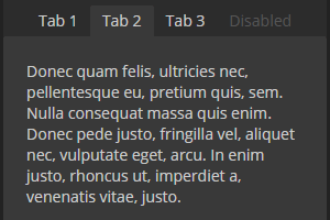
Tabs are commonly used to organize content into a single container. In Cx, tabs behave similarly to radio buttons. Tabs are selected on click and only one tab may be active at a time.
Window
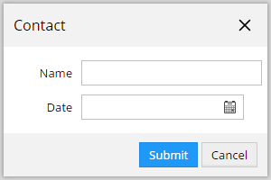
Windows are overlays with headers, footers and special appearance.
Message Box
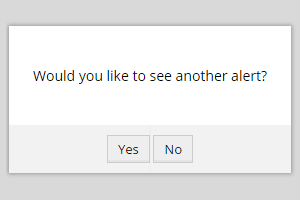
The MsgBox class provides utility methods for displaying alerts and confirmation windows.
Toast
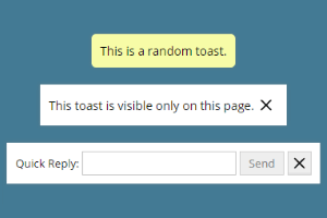
The Toast widget is used to inform the users about new events and offer quick actions. The position of the toast is controlled by the framework.
FlexBox
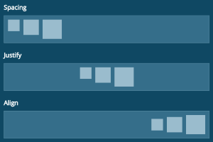
FlexBox is a convenience widget for setting up simple flex-box based layouts. FlexBox provides a number of shortcut options which make it easy to justify, align or add spacing to the content.
Lists
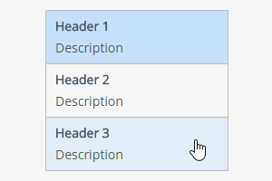
Learn how to utilize the List widget to display a collection of items that can be used for navigation and selection.